Goodreads
Case Study
Goodreads is a popular online platform and social network designed for book enthusiasts and avid readers. It serves as a virtual haven where individuals can explore, discover, and discuss a vast array of books from diverse genres and authors.
Case study at BCIT to understand UX/UI process
WHAT PROGRAMS USED
Adobe Xd for designing the prototype
Adobe Illustrator for high-fidelity wireframes and journey map
Adobe Photoshop for mockups
my process
Step 1. Empathize
Empathizing with Goodreads’ users involves deeply understanding their feelings, needs, goals, and challenges by stepping into their shoes and gaining insights into their experiences.
Step 4. Prototype
The prototyping step entails the creation of interactive, high-fidelity models of design concepts to simulate the user experience, gather feedback, and refine the design through XD and Invision.
Step 2. Define
When defining the user and their needs, you conduct research, create user personas, analyze user feedback, and validate assumptions to develop a comprehensive understanding of the Goodreads’ users and their goals.
Step 5. Test
Involves evaluating the usability and effectiveness of the website through various methods such as user testing, feedback collection, and usability assessments to identify and address any issues before final implementation.
Step 3. Ideate
The ideation step is a creative phase where you generate a wide range of potential solutions, concepts, and initial wireframes to address user needs and challenges through brainstorming and innovative exploration.
Step 1. Empathize
Some key issues I have found on the Goodreads website include:
- Overload of information throughout the website
- Lack of personalization for recommendations
- Community section unclear and confusing
- Unclear navigation
- Aesthetics / outdated UI
Step 2. Define
By gaining insights into Goodreads' target audience and constructing a user persona, I've identified the key user tasks necessary for achieving their goals. This process, coupled with a comprehensive analytical understanding, allows me to pinpoint issues that may hinder users in a user-friendly manner as they strive to reach their goals.
By creating this journey map, I have gained some insight of the pain points that users can feel throughout the user experience and from there target solutions that will help streamline their experience. This will help me in the next phase, where I begin sketching and wireframing solutions on the exisiting website.
Based on my research of Goodreads.com, I have identified key pain points that users make face throughout the user experience. Although there may be many pain points, for this case study, I will focus on my top 3, and propose some solutions that can alleviate any frustrations that users may face.
-
One big problem everywhere on this website is how much information is on each page and section. The navigation bar contains too many different links that it may confuse users on where to go. On top of that, in many sections there is a lack of hierarchy, so it is difficult to distinguish where they should click to or even read first. Users want an easy experience, they don’t want to think too much, and if there is too much information, they may be confused or lack the knowledge to make a sound decision, and may simply click off the site.
-
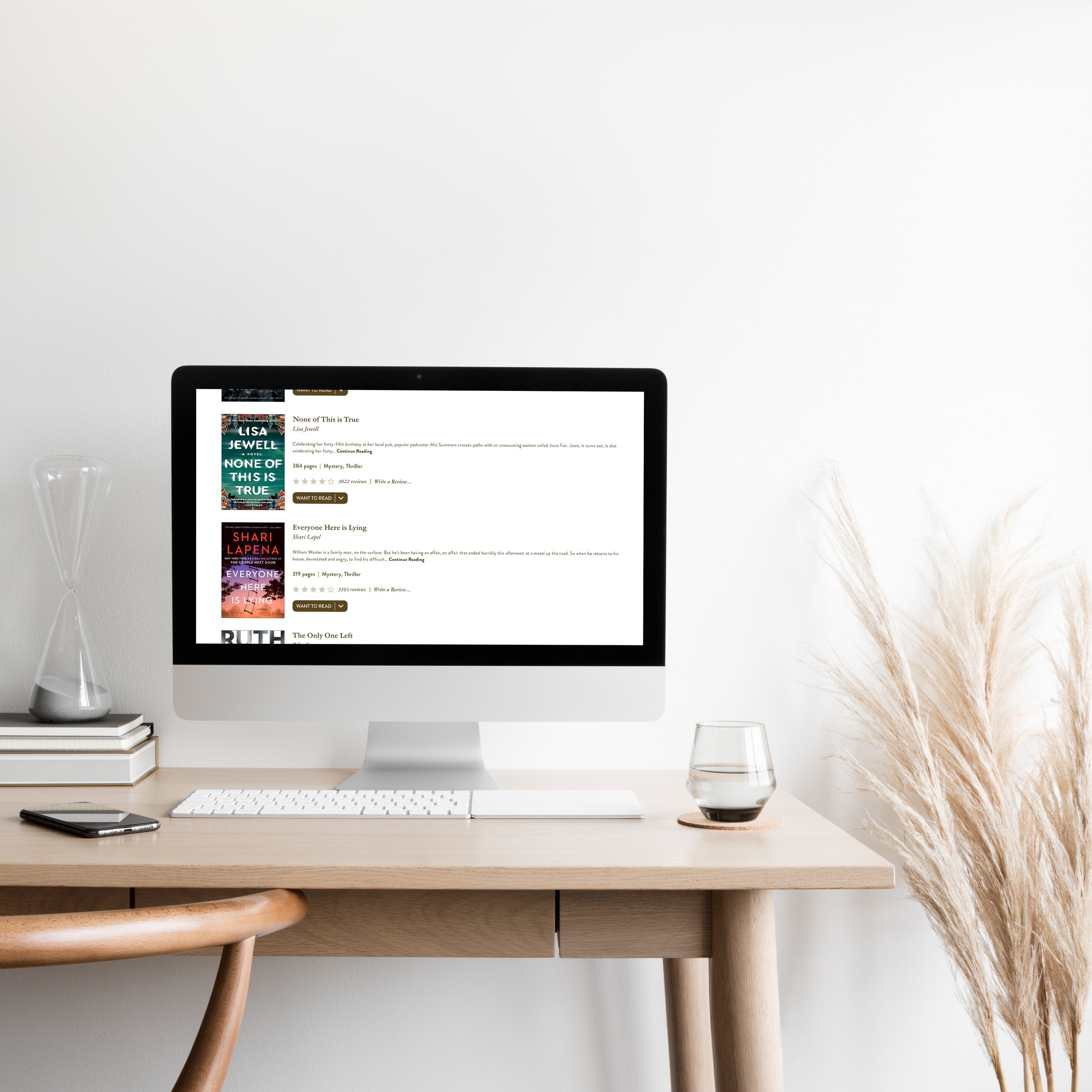
Finding a new book is already overwhelming, so to go onto Goodreads and not be able to find a recommended book specifically for a user’s wants/needs is quite frustrating. The recommended books are usually based off books a user has read read, not necessarily what they like or are in the mood for. Other websites use surveys/quizzes to determine what book a user would be recommended to read next.
-
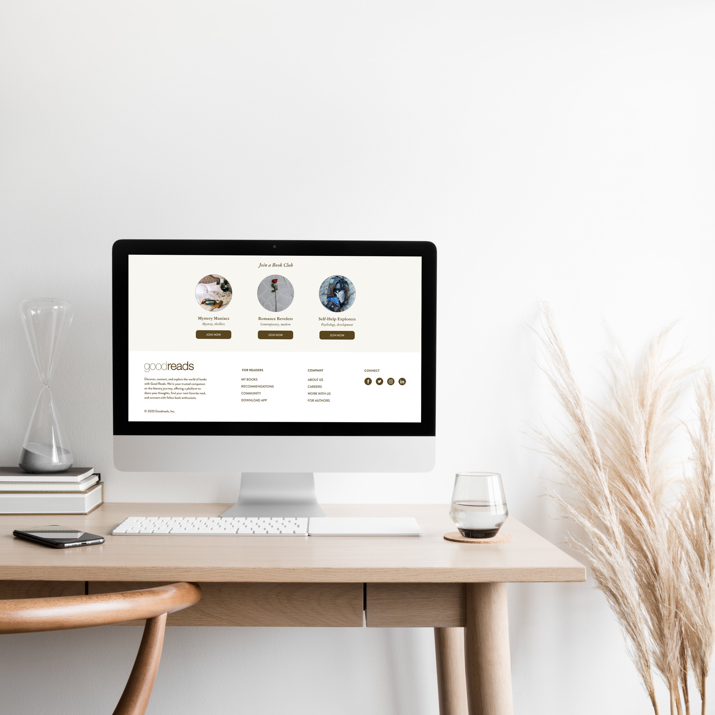
Community is such an important aspect of this website. However, these sections of the website are overwhelming users with too much information to the point where they may even click off. There is a lack of hierarchy, with text being similar sizes/colours and at first glance can be daunting. It makes it difficult for users to want to join a discussion or a group when there’s too much text to read/understand. When text blocks are easily digestible and understable, users tend to have an easier time making decisions.
Step 3. Ideate
Identifying the pain points is crucial to providing a better user experience. Now that they’ve been identified, I can now propose solutions through low-fidelity and high-fidelity wireframes. Each step has played an important role in understanding what gaps there are in the current website and what can be done to help users accomplish their goals in a better and easier way. Creating these wireframes help me with layout design, label/CTA placements, navigation, and the overall structure of the website.
Step 4. Prototype
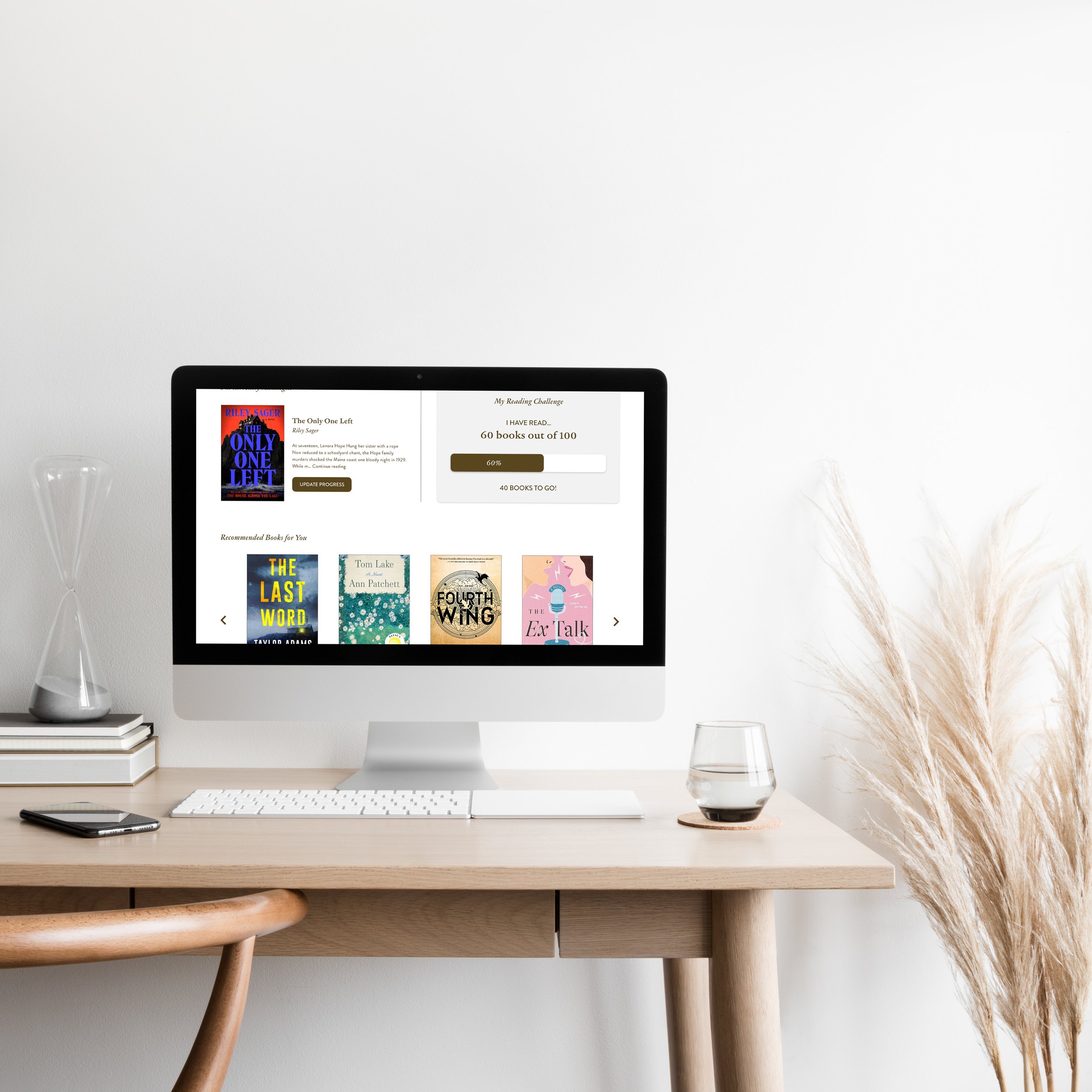
Prototypes are interactive models that facilitate user testing and feedback. The prototypes that I have created for this case study were done in Adobe XD. When I started adding actions to my prototype, I used InVision to connect the different pages and sections together so it resembles what it would be like when it’s finalized and implemented.


